Earth Is Not a Sphere: NASA’s New Gravity Map Reveals a Lumpy Planet
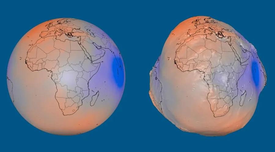
Usagevpn.com – This summer, a striking image circulated through science channels and social media feeds: our planet rendered not as the familiar blue marble, but as a lopsided, dimpled object that resembles a bruised potato. The image is NASA’s latest visualisation of the geoid — a mathematical representation of how gravity actually behaves across the globe. While the picture is deliberately distorted to make invisible variations visible, the underlying physics is entirely real. Gravity does not pull with uniform strength from pole to pole or from ocean basin to mountain range, and that unevenness leaves measurable fingerprints on where water would settle if left undisturbed by wind, tide, or current.
What the geoid actually is
The geoid is not a photograph of Earth’s surface. It is an imaginary equipotential surface: the shape the world’s oceans would assume if gravity and planetary rotation were the only forces acting on them. In practice, that surface extends beneath every continent, defining a theoretical sea level that threads through solid rock as readily as through open water. Because mass is distributed unevenly inside and across the planet — dense mantle plumes, shallow oceanic crust, towering orogenic belts, deep-sea trenches — the gravitational field varies from place to place. Regions carrying extra mass tug water toward themselves, producing theoretical bulges in the geoid; regions with comparatively less mass yield theoretical depressions.
Understanding this distinction matters. A reader might assume the potato-shaped image depicts actual topography. It does not. The continents, mountain ranges, and ocean floors retain their real shapes; the geoid is a gravitational contour layered over them, invisible to the naked eye but critical to precise measurement.
The scale of the distortion
To make the effect perceptible, NASA amplified the geoid’s height variations by a factor of ten thousand. In reality, the spread between the geoid’s highest and lowest points totals just 191 metres — roughly the height of a sixty-storey building. Around Iceland, the theoretical sea level sits 85 metres above the reference ellipsoid; south of India, it dips 106 metres below that same baseline. The reference level itself is a smooth, slightly oblate mathematical model of Earth, chosen as the zero point against which all gravitational deviations are measured.
For context, a 191-metre swing sounds modest until one considers that GPS receivers, satellite altimeters, and ship-borne gravimeters must account for these deviations to deliver centimetre-level accuracy. Ignoring the geoid would introduce errors of tens of metres into any height measurement taken far from a local tide gauge.
How the picture was built
The visualisation rests on more than one billion individual gravity observations accumulated over fifteen years by nineteen satellites. Two missions stand out among the contributors. NASA’s Gravity Recovery and Climate Experiment (GRACE) pair tracked minute changes in the planet’s gravitational field as water, ice sheets, and groundwater shifted mass from one hemisphere to another. The European Space Agency’s Gravity Field and Steady-State Ocean Circulation Explorer (GOCE) carried a superconducting gravimeter that mapped the static field with unprecedented spatial resolution. Together, their data streams — supplemented by earlier and concurrent missions — produced the dense, global gravity model that underpins the summer release.
Why the science matters beyond the screenshot
The geoid is far more than a curiosity for infographic designers. Researchers track its slow evolution to monitor how melting ice sheets redistribute mass, how seasonal snowpack loading flexes the crust, and how deep mantle convection reshapes the gravitational landscape over geological timescales. For operational users, the model feeds directly into geodetic surveys, hydrographic charting, and inertial-navigation systems aboard ships and aircraft. A vessel plotting a course through the Southern Ocean, for instance, relies on geoid-corrected height data to interpret satellite altimetry and avoid shallow features that a purely geometric model would misplace by tens of metres.
NASA has emphasised that the same gravitational information supports mapping, surveying, and navigation tasks worldwide. In an era when autonomous vehicles, precision agriculture, and coastal-flood modelling all depend on centimetre-grade vertical positioning, the geoid is not an academic footnote — it is load-bearing infrastructure for the measurement systems that keep modern infrastructure safe.
The potato image, then, is a doorway. It translates an abstract potential-field calculation into a single glanceable shape, inviting the public to ask what lies beneath the lumpiness. The answer is the planet’s own interior architecture, written in gravity, read by satellites, and rendered visible at last.
Related Reading
Frequently Asked Questions
What is The geoid?
The geoid is the main topic of this guide. The article explains the context, practical details, and next steps readers should understand.
Why does The geoid matter?
The geoid matters because readers are looking for a useful answer, not just a short summary. Good content should match search intent and help them decide what to do next.